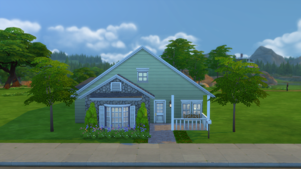
Hello everyone! I have another house build for you today and this time I decided to try Rory’s Build Challenge to add another layer of difficulty to my house building. I probably won’t do a house building challenge every week, but I’ve been wanting to try this one.
I am really happy with how the house came out. I was able to stay about §2,000 under budget and still managed to get the house to look as close to the build challenge house as possible. I did have to make a couple of changes to the rooms as one room was a laundry room. Since we don’t have laundry items in The Sims 4, I decided just to make the master bedroom a bit bigger. All-in-all I think it went really well and I definitely want to try more house build challenges in the future (if you have any suggestions for a house build challenge, let me know in the comments below). Now, onto the house tour!
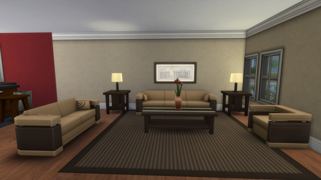
We’ll start in the living room since that is the first room that you will see when you enter the house. I kept the colors very neutral and earth toned as the kitchen/dining room are extremely bright and colorful. I didn’t want to have too many competing colors in one space. Though I did add a tiny pop of color with the flowers.
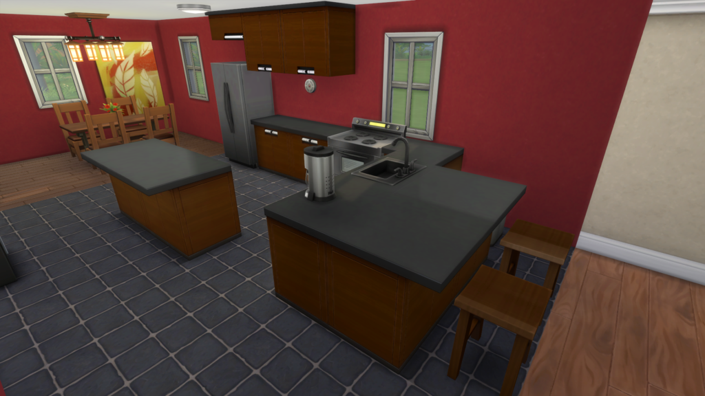
And as you can see, the kitchen/dining area is VERY colorful. I don’t know what it is, but I adore red in kitchens. I think it’s just so warm and welcoming. I carried the red over to the dining area as well and I’m really happen with how it came out.
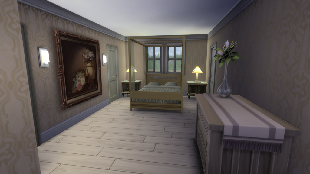
Next up is the master bedroom, which like I said is a bit bigger than in the initial layout as I expanded it since I didn’t feel the need to make a laundry room. I kept the colors in this room pretty neutral as well.
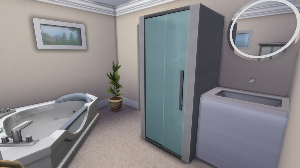
I carried a similar color scheme to the master bathroom. I think I probably spent a good portion of the budget in this room as I really liked the idea of the master bath having some higher end/spa like feel to it. Not gonna lie, if I had this bathroom, I’d probably never leave!
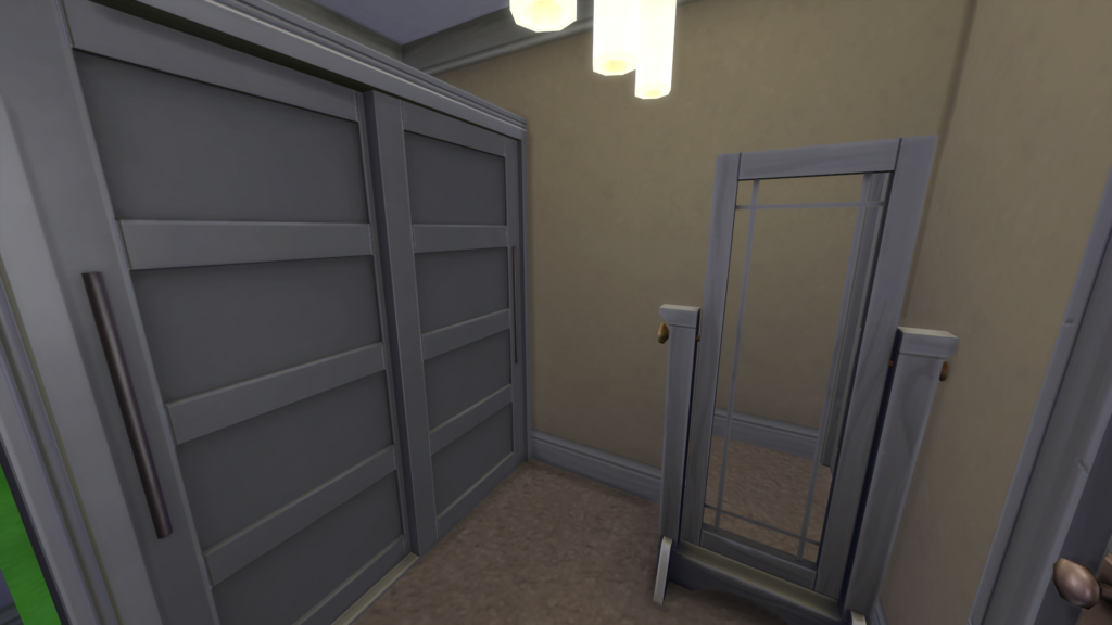
The original layout of the house had a walk in closet, which isn’t really easy to do in the Sims 4 right now, but I made a small room and put a closet and mirror into it. Good enough I guess!
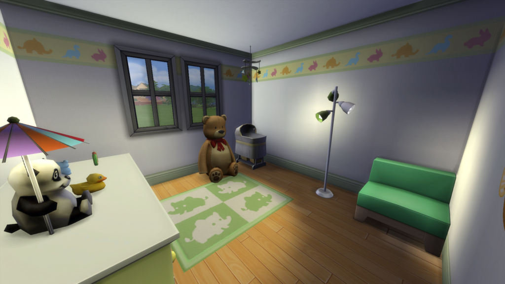
I turned the smallest bedroom into a nursery and stuck with gender neutral shades so that it would work for a boy or a girl. Plus, I really like light greens and light yellows in nurseries. It’s what I did for my own kids’ nurseries when they were babies as well!
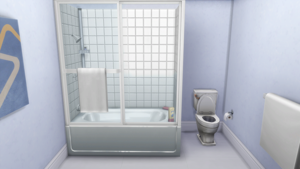
The second bathroom has a very light, powder blue theme that reminds me of the bathroom in my old house.
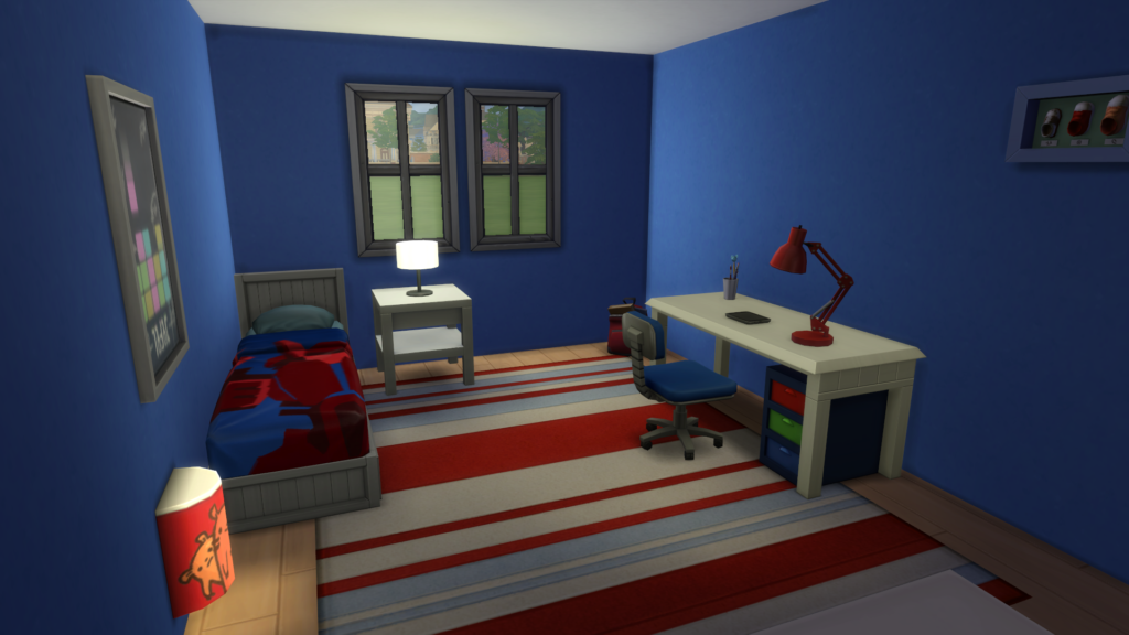
The final bedroom in the house I decided to make into a boys room. My younger son wants to paint his room a similar color to this, so I kind of used the game to help me plan it out a little bit. I like how the blues and reds really work well with each other.
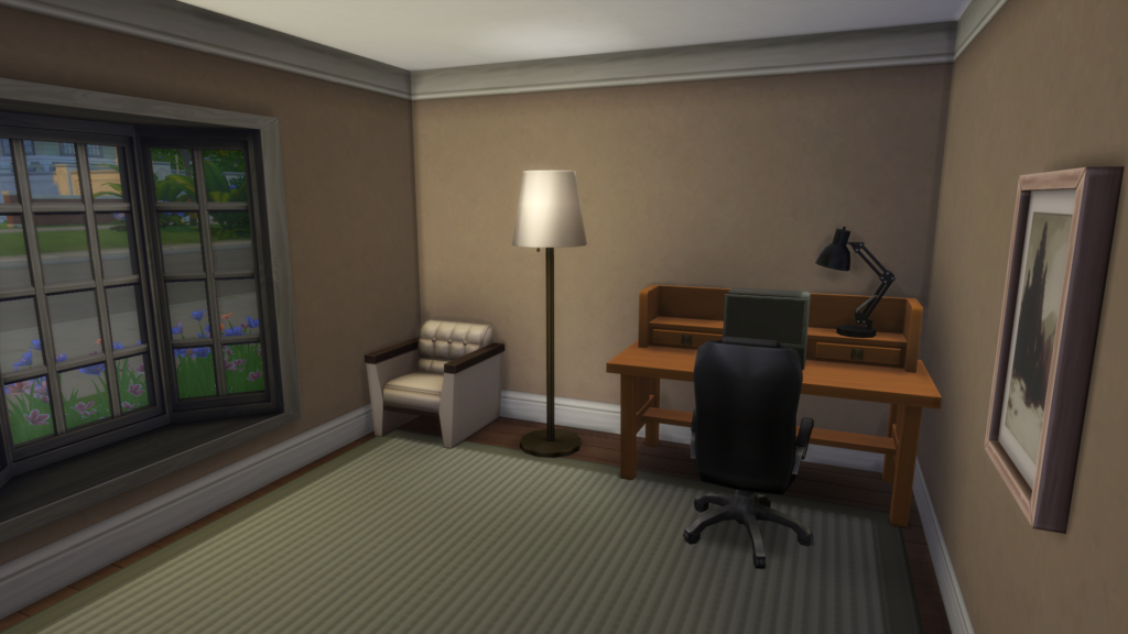
The final room in the house is the office. Again I went with warmer more neutral tones. I was starting to run out of money by the time I got to this room, but I think it came out great. I really like the bay window. Our home office in our old house had a bay window in it as well.
I hope you enjoyed this house tour! The house will be up on the gallery and you can search for it by looking for my username (Pinstar1161 – we share an account) or by looking for the hashtag #rorybuilds. You can also head to this direct link.

Yay! I’ve been looking forward to this!
I like the mix of colour and neutral/earth tones. Out of all the rooms, I think the boys room is my favorite!
Nice house!
Very nice! I love how you balanced bright colors with more neutral tones. It looks great, it has character but isn’t too overwhelming. I agree about the master bathroom, if I had a bathroom like that I’d spend way too much time there 😛 I also love the kitchen/dining area and the living room.