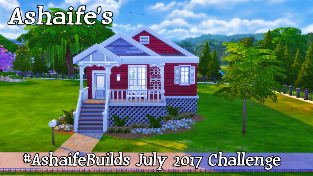
That’s right, I have another build challenge today! This time it’s Ashaife’s Build Challenge for July 2017! What can I say? I’m kind of addicted to them and I’ve learned a lot about building by doing these! I had a great time with this one, though I did suffer a bit from “decorator’s block” after finishing the exterior. So it took me a little longer to decorate this house than it normally does. That being said, I think it came out great and I’m really pleased with the final results!
I’m equally pleased with the red exterior of the house. I’ve always liked red houses. Probably because I grew up in one and it reminds me of my childhood. I’m gradually getting better at my landscaping placement. It’s starting to look more natural than it used to.
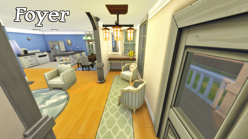
The first room you see upon entering the house is the small foyer where I have added a hallway table and some seating. I stuck with fairly neutral colors in this room as the great room is much more colorful with it’s blue theme.
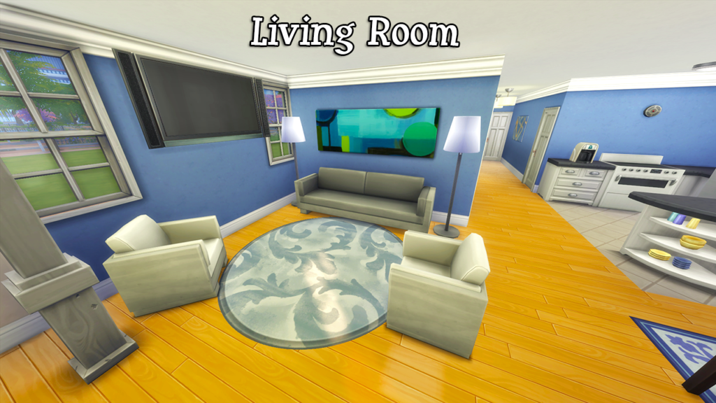
Next up is the living room side of the great room. This sky blue color persists throughout the entire great room and provides a nice calming feel to the house. I adore blue rooms. The white couches work really well with the blue as well. They kind of remind me of clouds in the sky.
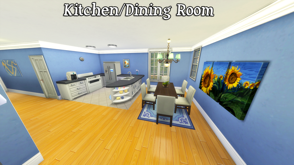
On the other side of the great room is the kitchen/dining area. Again, the blue theme carries over to this side of the room as well. I also decided to go with a bit of a sunflower theme here. I think the yellow of the flowers goes really well with the blue! That door to the side of the kitchen is a small pantry area. According to the original layout, I believe it’s actually supposed to be laundry, but since we don’t have those items (yet) I decided to make it a pantry.
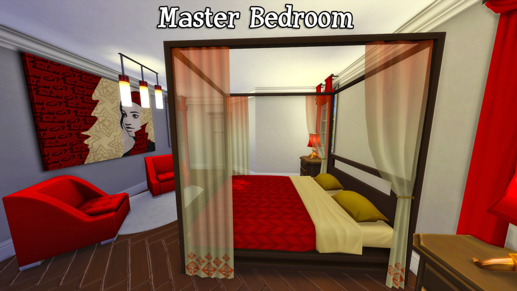
In the Master Bedroom I decided to stick with a neutral light grey wall color, but added tons of color with the furniture. I really like the combination of bright red and grey together. I think they compliment each other really nicely and the red makes the room nice and bright.
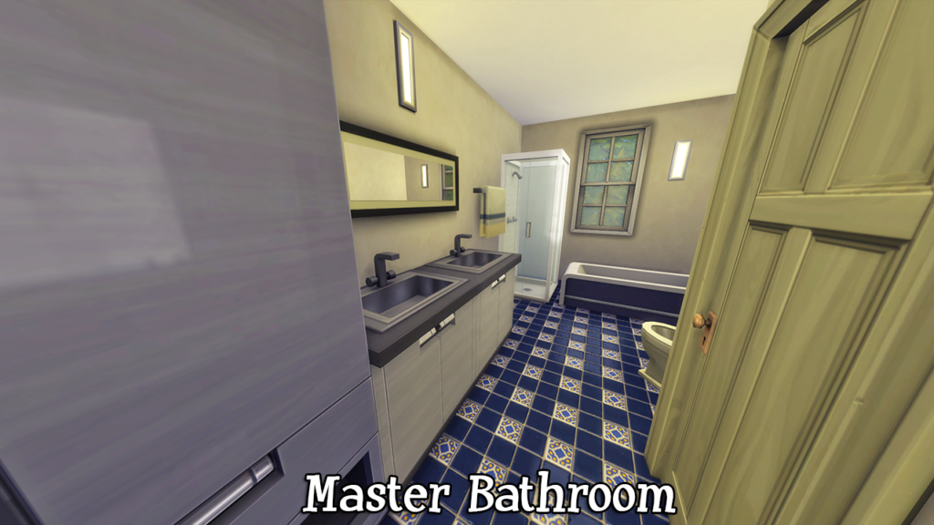
The Master Bathroom is much more neutral colored than the Master Bedroom. The only really color in this room is the dark blue floor tile, but I figured it would be nice to have a more muted bathroom when you have a bedroom that is so bright and colorful.
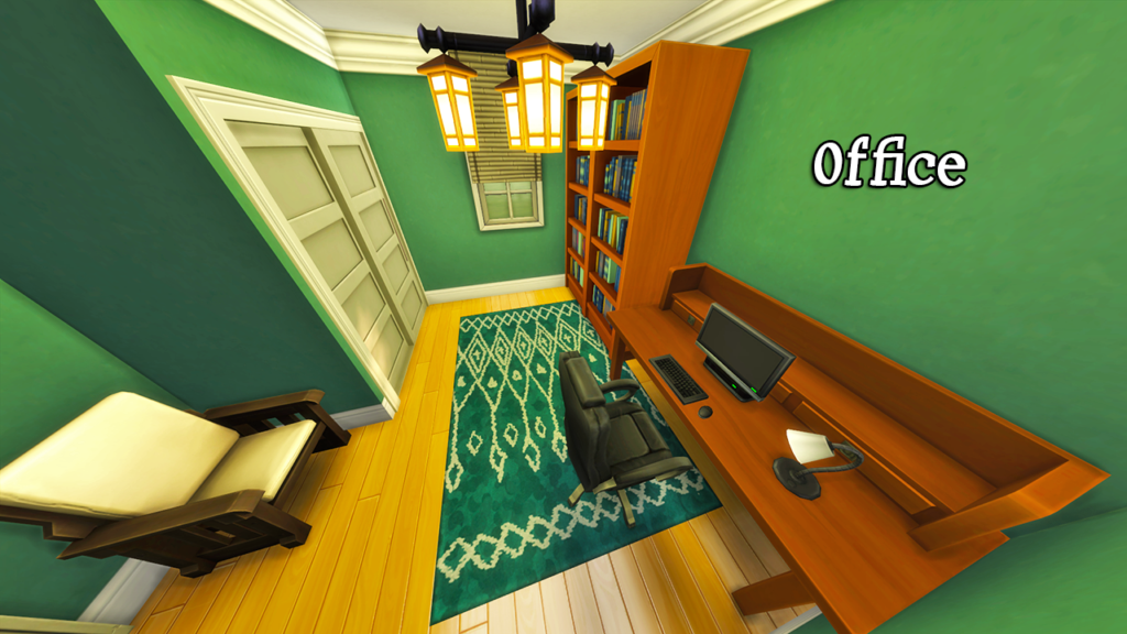
Rather than make three bedrooms in this house, I decided to turn the smallest bedroom into an office. I went with green, for no reason other than the fact that I wanted to go with a color that I hadn’t used in this house yet, haha.
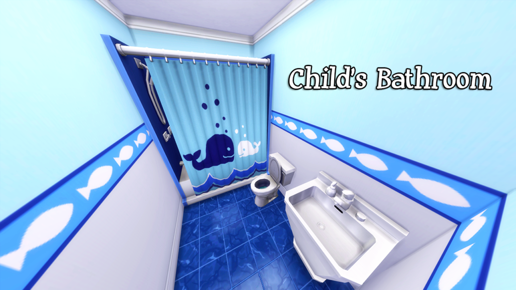
The final bedroom in this house (which you will see in a moment) is a child’s bedroom. So I thought a child themed bathroom would work well for the smaller bathroom in this house. It’s got an awesome ocean theme!
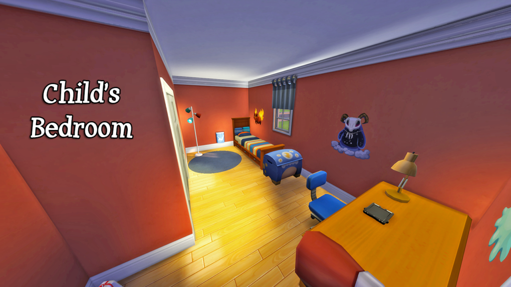
The child’s bedroom has a pretty unique color scheme with a dark orange and dark blue theme. I actually think those colors work really well together, which surprised me quite a bit. I’d say this room is better suited to an older child, but it would work well for a toddler as well if you changed out the bed.
Finally we have the top-down view of the house. I tried to get my layout as close to the original as possible. I had to deviate a little, but for the most part, it’s pretty similar!
Want to download this build? You can find it on the gallery by searching for EA ID Pinstar1161 and the hashtag #AshaifeBuilds.
Ashaife will be doing live tours of the houses entered in her challenge on her Twitch stream. Be sure to follow her so you can check them out!

